Colors in the Kitchen and Bath
Color
Noun, often attributive | col – or | \’ke-ler\
1. a: a phenomenon of light or visual perception that enables one to differentiate otherwise identical objects.
Color can set mood, highlight a specific feature, make a space feel larger or smaller, or draw the eye up, down or through the space. It can energize, promote relaxation or support healing. Color can create a feeling or warmth or coolness, and it can provide a neutral backdrop, a bold focal point or a bright, clean vibe. Color can also inspire calm, or provide a simple moment of joy.
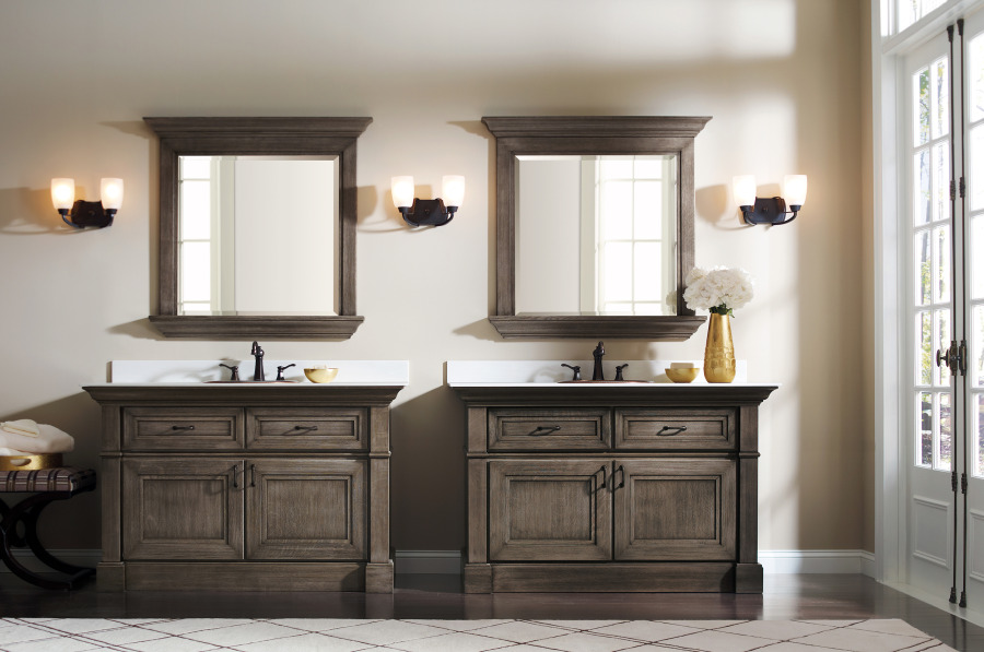
Hot Colors for 2017
As we step in to a new year, Joe Kujawski, business direction, Wood Segments for Sherwin-Williams Product Finishes Division, expects to see “grays (no surprise) and taupes – bold and warmer neutrals as well as greens, blues and yellows. These trending hues typically seem to be darker in the sense that they’re more saturated and vibrant, while having a lot more character than their softer counterparts. Colors we expect to be hot are warmer neutrals.”
In the kitchen he sees that green is coming out more in accessory pieces, as well as quartz countertops that offer deeper greens “that are almost black, but less hard, so they work beautifully with the grays that remain so popular.”
As far as metal finishes go, Woodman says copper and gold are by far the hottest up and comers, explaining, “Lots of accessories are coming up in copper and gold, really pretty metals, with a lovely warm look. Copper is the quintessential color for the kitchen.” These metal colors have a tendency to uplift the entire space.
Benjamin Moore Color & Design Manager Hannah Yeo agrees: “Metals are important in both kitchen and bath for the upcoming year. From oil-rubbed bronze to warm, tinted gold, warm metals adds texture.” These can be enhanced with a variety of sheen levels in paint, she adds, with higher sheen paints reflecting more light that creates ambiance in the room.”
With the shift to warmer hues, Yeo sees “palettes and textures [that are] moody and organic. Browns, ochre, copper tones and even deep rich greens are also emerging.”
Pantone’s top ten colors for spring of 2017 offer a palette that includes earthy hues, as well as some brighter colors that reflect a sense of energy and vitality. Niagara, a classic denim-like blue, was chosen as the most prevalent color for spring 2017, while Primrose Yellow suggests a renewal of hope and enthusiasm.
Gray & White
Gray continues to be a strong favorite but it is evolving, particularly in the kitchen. Woodman says, “The early versions [of the color] are expanding to transparent gray on wood, which is kind of interesting because you can get a warmer gray with a red finished wood; the neutrality is holding on.” He also sees grays expanding into charcoal shades.
Clean white looks are as hot as ever, and Yeo maintains, “The classic white kitchen cabinets will always be in style. Gray will continue its popularity as well. The kitchen is the heart of the home where family and friends connect with one another. Neutral colors become the perfect backdrop to prepare food while nourishing our minds, bodies and well-being.” She also sees grays and charcoals working well with the white marbles and marble looks that are coming into vogue.
*Janice Costa – Color Joy: Kitchen & Bath Design News